Tuesday, 31 January 2017

Author Genesis - British Museum & Hunterian Museum

I decided to spend today looking at some museums that would be relevant to my work. I first went to the British museum because they have a huge selection of masks and costumes specifically in the Africa section. They also have Ancient Egyptian cats. I'm a bit stuck for ideas for this costume. I'm not very good at designing creatures from my head without having something to look at in front of me. Nor am I great at making things 3D so I've been finding it quite difficult to come up with something related to my five words. I don't want to show my 5 words in my costume literally but want to take elements from the words and use them as inspiration to create something quite abstract but still recognisable/realistic in form.

I really liked this 3D form below. Although it is very abstract, you can still make out a face and a being. I like the combination of materials used like the contrast of the rusty metal and the plant like green strands coming out almost like hair.


I couldn't see many cats which is strange because I thought the cat played a big part in Ancient Egypt. I did find a few sculptures and bought some cat postcards to help me with my research. I didn't find them particularly inspiring but they could help when it comes to making my 3D being since I might use a cat-like face on my costume.

I sketched a few cats and some things I found interesting or costume-like in the Africa section:


Monday, 30 January 2017

Author Genesis - Research

I began by researching my 5 words to try to plan what my 'being' might look like. I know that I want to make something a little bit disturbing so I've started by looking at creatures and beasts from the Harry Potter movies for inspiration. I'm ridiculously obsessed and watch the movies frequently anyway so I'll do some sketches of interesting creatures later.


Since one of my words are 'tea', I know I want to make a creature that belongs under water or is inspired by water/liquid. I started looking at merpeople from the Harry Potter movies and went back to some mermaid sketches I've done in the past for reference.


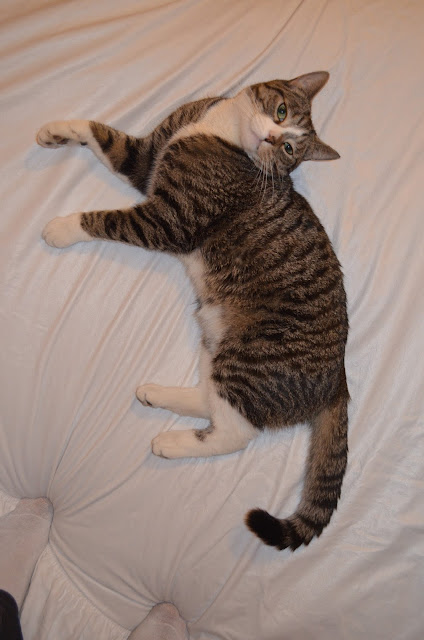
I went back to some of the photos I took of my cat Kyle and started to sketch out cat like features but warped them around a bit to create something more sinister. I used my Harry Potter research as inspiration.


UNIT 4 - Author 1 - Genesis

Today was the deadline for unit 1 & 2. I'm so relieved that its all done and handed in.
I decided to take a look at the unit 4 brief for Author Genesis. This project looks really interesting and quite challenging. As I've said a few times previously, I have little experience in making 3D objects and quite frankly, wouldn't know how to start or what to use. I'm still quite excited by the fact that we've been asked to create a full costume for a 'being' inspired by our own world and the objects that matter to us.

The first task on the brief was to look over our Christmas holiday drawings and reduce our world down to 5 fundamental requirements. Taking these 5 words, we had to write and illustrate them on to an A4 sheet.

I don't know if I was supposed to spend over an hour on this task and go in to so much detail but I've really missed detailed drawing. I chose the first three things from my Christmas drawings but added tea and Harry Potter because they are things I can't live without but didn't get a chance to draw.

-----------

I decided to have a look at the artists recommended on the brief to get an idea of different styles of costume and fashion designs, materials, fabrics, shapes and colours.


 I looked at everybody on the list and noted down the ones that caught my eye. There were a few artists and designers I recognised including Leigh Bowery. I've always loved his exaggerated and  innovative designs. I really liked the shapes and structure of this. It almost looks like a caricature drawing as oppose to an actual person in a costume.


Another two artists are the Chapman brothers. I looked in to their work during my degree 3 years ago and particularly liked their 'Hell' sculpture series. The brothers tend to depict a sick reality within their work. It is usually very shocking, disturbing and usually pornographic. 
Their use of structure and shape is what drew me in to their work for this project. 
I also found some of their masks and sculptures and really liked their style.


These reminded me of some of the masks in the Mexico and Africa section of the British Museum however, these definitely have a more dark and demonic feel to them. I think its the exaggerated tallness and structure and their clown-like faces that make them so creepy.


Nick Cave is one I hadn't heard of before. I really love his use of colours and the combination of lots of layers of different patterns and fabrics. I feel that his works are abstract pieces of art rather than  costumes as you can almost not see the person wearing them.

Saturday, 28 January 2017

Subject Object - FINAL POSTERS finally

IT'S FINALLY DONE!
This was literally the longest thing ever. Its 2am, I've been at it since 8pm and it looks like 1 hour of work... This was a struggle for me because I'm not very good at drawing from or creating on a computer. I took a big risk by using this method for my final but I just couldn't picture it any other way. I'm pleased with the results. I like the simplicity and the colours used. I didn't want anything too crazy or too detailed in this poster and I think it's worked quite well.
I do think that I could have done a much better job on these if I was more advanced in using Illustrator. I feel that there is something missing but I can't seem to figure it out.

Like I said in my previous post, I did prefer the text below because I felt it was more relevant to the image however, I feel that my second poster worked better visually. I particularly like the crimson blood colour I used on the word 'beat' to make it a bit more dramatic.

Another thing I'm terrible at is sizing and printing. I'm going to be really annoyed if these are pixelated when they're printed tomorrow.


I loved this project. Although, I feel that I could have done better had I used my time more efficiently, I felt this project was more self-led and independent compared to our other briefs. I liked the freedom of looking for my own news article and creating my own topic but still having workshops at class with the tutors and a brief. This project really taught me the importance of experimenting with ideas and not sticking to the first thing that comes to mind.


Friday, 27 January 2017

Subject Object - Making the final poster

I decided to experiment with Adobe Illustrator because I thought it'd be more powerful for a poster. Also, I hadn't used digital media for uni before and have done lino a few times already.
I started by making a few sketches of possible poster ideas to get an idea of what to make on my laptop.


I created a simple outline of my cat on illustrator, then printed it out multiple times to draw what the colours might look like.


I then began to play around with different shapes and colours on Illustrator to see what would work best.


I played around with colour for a while and realized that a simple black and white theme worked best. I downloaded a few fonts. I wanted the focus to be on the cat and not so much a decorative font so I kept it quite simple.


After creating a few versions of these, I realized that my initial scrap poster still seemed to work better. I realized that having a photo of a real life cat was more powerful than having a simple silhouette. Having a photo of an actual animal makes a poster more eye catching and disturbing as it hits a more personal level.

I then took some more photos of Kyle on some white sheets, erased the background on Photoshop and bought it back in to Illustrator and turned it in to a vector drawing. I still wanted to keep that digital and minimal feel to the poster without completely erasing the details of Kyle so I thought a vector would work best.


I had two ideas for the text. The first one was 'What if they beat your cat for applause' and the second was 'If they don't dance, they don't eat'. I thought that the second one might work better with the image and tested that out. Then I played around with the layout.


This is my final image so far:


I like the structure of the text with the image and think the simple colours work quite well. I'm still fairly new to Illustrator and feel that this idea could have worked better if I knew how to use it properly. I want to play around with something suttle for the background, maybe a classic stripy circus pattern to really bring out the image of the cat or a simple silhouette of a circus tent...


Thursday, 26 January 2017

Subject Object - Starting the final poster

I decided to stick my posters up on my wall and ask people which poster they thought was the most powerful and looked the best aesthetically. I got some mixed answers but selected 3 I liked most then decided to use this one:


I like this idea because its extremely direct and quite simple. It involves a typical household pet, looking extremely uncomfortable, which I think would grab peoples attention the most. Nobody would want to put their pet in harms way so I feel that a more personal poster like this would allow people to make that connection between their own animals and wild animals in the circus.

I decided to take more photos of my cat Kyle in the position I'd probably want to draw him in. I'm still not quite sure how I'll make my final poster. I want to use digital media because I haven't used it on this course before but also really want to make a print by hand.

My digital poster would be of Kyles silhouette and would only include the details of the tutu and hoops he'd be wearing in block colours.
If I do a lino however, I'd want to do one in A3 and make it quite detailed, maybe scan them then use watercolours? As for typography I still don't know. We'll see how it goes...


Wednesday, 25 January 2017

Subject Object - Playing around with lino, mono prints & font

Made some lino prints on my birthday :) Its the perfect week for me to have a birthday (5 days before the deadline for unit 2)
At this point, I have NO IDEA which poster idea I'm going to use for my final piece. I have no clue what kind of process I'm going to use for it and the deadline is only a few days away.
I decided to choose one random poster that I could potentially use and make some lino prints focusing on the circus typeface rather than a drawing.
It took me 2 hours and a cut in my finger to complete the lino but I got there in the end.


I started with a few simple ones to see if it'd work better in colour or black and white. I then wanted to see how it'd look as a poster if I made the entire thing with lino so made something similar to the posters I made in the typography workshop.


I didn't want to waste the ink so I made a couple of mono prints related to my elephant idea.


I'm quite happy with the outcome but don't think I'll be using this idea or method for my final piece. I had an idea of making this poster in a horizontal format with the writing 'THIS IS YOUR CIRCUS' stretched in to the shape of a circus tent. I think this would work best digitally but overall, I don't think its a particularly powerful idea for a poster.
This task was useful as I played around with colour and experimented which allowed me to get a sense of what my final piece would look like.