Saturday 2 December 2017

Ghost post final stamp development

I decided to go with my dinosaur in the city idea as I wanted to incorporate some famous London buildings on to my stamp along with the dinosaur. This was so that the stamp would look recent and be in celebration of the successful genetical cloning of the dinosaurs.
In my initial collages, I couldn't think of a way to show that the purpose of my stamp was to show that  the dinosaurs had been cloned so I thought adding in some tall buildings and modern elements would help to show that.


I decided to draw out a simple design on photoshop to begin with and played around with the background colour and realised I wanted to stick with the simple sky blue background and silhouette shapes. Since this is a small design for a stamp, I wanted to keep it as simple/minimal as possible.


This was my second time ever designing something on illustrator. Last years Monopoly board was a lot easier because I only had to make simple square & rectangle shapes and play around with colour.
This was a huge challenge for me and I struggled a lot. It took me hours to figure out how to use paths and cut shapes out of other shapes but I finally managed to get it done.


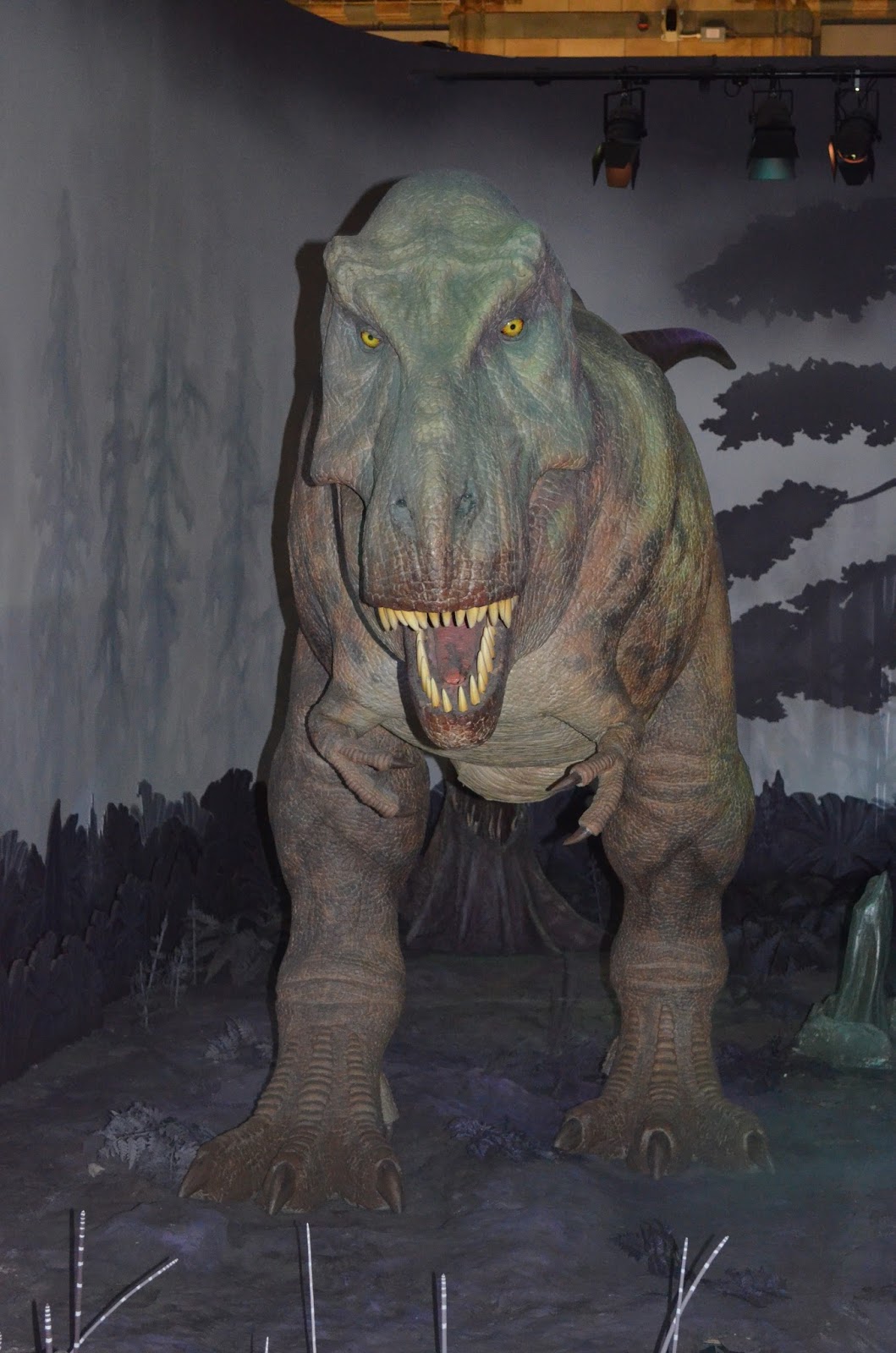
After this, I designed a simple dinosaur to put in to the image but wanted to bring the dinosaur forward outside of the border, without ruining the shape of the stamp. I didn't know how to cut off the excess.


With a bit of research I came across something called 'clip pathways' which would allow me to seperate the bottom section of the dinosaur without hurting the rest of the design.
This failed completely. Instead of cutting out the dinosaur, the tool put the stamp design inside the dinosaur design (which was still useful to learn for future reference).


After playing around some more, I finally managed to clip the bottom section of the dinosaur to fit the stamp design perfectly!

This is my final design for now. I need to add on the price and queens head to complete it and then I'm going to play around with colour and shapes some more to see if I can improve anything else.


Wednesday 29 November 2017

Ghost Post - Development - Lino Prints


I made some lino prints of my plane/dinosaur idea to see how it would work for the stamp. I made two smaller lino stamps of the plane and dinosaur but didn't really like the way these looked on the print. I do like the way these turned out but I think I want to try this idea on illustrator or photoshop.


I made two smaller lino cuts of a plane and dinosaur but didn't like the way they looked once stamped. So I decided to cut them out of black paper, scan them in and play around with them on Photoshop.
I love the way this one turned out but I still want to play around with Illustrator to create a second stamp.

Tuesday 28 November 2017

Ghost post project - development

Today we started designing some ideas for our stamps by collaging bits of paper together to form ideas. I had no idea where to start and could think only of literally drawing a dinosaur for my stamp. 

I started off by collaging different coloured papers and shapes together to make some dinosaurs. I didn't give this much thought as I just wanted to focus on getting started and hoped it would lead me to better ideas.

I was not happy with these at all. Not only were these really boring & cliche, they also didn't work with the brief. I wanted my stamp to show dinosaurs living with us today and that they were genetically cloned as that was the point of the brief.
I then started to experiment with collaging DNA and cells but couldn't think of how I'd link them with the dinosaurs without crowding the design. I thought of drawing small dinosaurs in hatching eggs on conveyor belts but thought this would only make the design more complicated.


Looking back at my initial collages, I thought it'd be a good idea to have an ongoing colour scheme for a few more designs. I wanted my final stamp to be to the point and not intricately detailed so I went with my first simple dinosaur collages and added some modern details to make them look recent.


I'm very happy with these as a set. I'd like to develop them further and play around with the colour schemes and designs on illustrator.


Saturday 25 November 2017

Ghost post primer

I decided to take a trip to the Natural History Museum to see some of the dinosaurs and read through their history/facts to get inspiration for my final stamp.
I'd been before but years ago and didn't realise how big they actually were! This was great for my motivation as I've been lacking that recently.


Tuesday 21 November 2017

Ghost Post project

For this new project our task was to pick something that happened in history then re-imagine what could have happened. The final piece is going to be a stamp design that can be printed very small but A1 as well that relates to this moment in history.
I chose to think about what would happen if dinosaurs were re-created by genetic cloning (like in Jurassic park.) I thought this would be interesting to do as it's something that scientists have actually considered doing and I believe it could be successful in the future (even if it isn't with dinosaurs.)

I started off by doing some general research on dinosaurs to get an idea of what they looked like and their history to inspire me for design ideas.
I also looked at some other commemorative stamps from British history.
I particularly liked these ones:


Agatha Christies stamps

I love the minimal use of colour in this set. All of the stamps work really well together as they have an ongoing theme and have only used small hints of colour in certain places.
 London underground stamps

I want my final stamps to be in this kind of style where there is little detail but instead, shapes and silhouettes to make shapes. With a design that would mostly be printed very small, I think its important not to get lost in detail but instead, focus on what it's trying to depict.
I also like the muted tones and colours and the use of space where there are contrasts of empty areas and more detailed areas.


Monday 6 November 2017

Fact Film - Final Posters

I made two posters to go with my film. I wanted something simple and eye catching so I drew this cow design by hand then turned it in to a vector on Illustrator and edited the colours.
I want my focus to be the film which is already quite self explanatory and shocking so I think these work well because they have some colour, one main design and quick information about the film.


Saturday 4 November 2017

Fact Film - Making the video

I started by gathering some of the clips I'd found on youtube and playing around with flashing text. I'm usually not the best with video programs but found it quite fun to click around and discover different effects and adjustments. I wanted to create a short video showing the irony of milk & cheese adverts. In the laughing cow ad, the cows are happy and laughing about this cheese product being promoted when in reality there is nothing happy or funny about this process at all - especially not for the cows. It's actually quite disturbing to make advertisements like this so I wanted to create something short but to the point and show the reality of what really goes on behind the scenes.

This is my first draft video that I'll be editing later:


I'd never made anything like this before. It took me a while to figure out how to put a video within a video and I struggled quite a bit with adding text at the right time. I am pleased with the way this turned out. It did turn out to be how I wanted it to in my head but I feel that I can add more to it to make it longer and better. I think this works with the message I'm trying to put across.


This is my final film. I learned a lot about video editing making these films. I tried to add some more effects and play around with text and transitions for this video. I also experimented with the slow motion and fast effect which I think worked well. I wanted to show a sense of irony with the happy cows in the advertisements alongside what goes on in reality.
I tried to make use of the lyrics and music from the advertisement to make my point and almost made a comparison between the happy cow and the miserable cow.

Wednesday 1 November 2017

Fact: Film - Idea development

Possible commercials for my film:


Monday 30 October 2017

Fact: Film project - Research

After watching some of the videos referenced on Moodle, I got a better of idea of what kind of techniques I could use for my film.
I want my video to show a sense of time - a process of buyers/demand for dairy and consumption. I want to then play around with the idea of using an existing '"happy" dairy farm commercial for milk and maybe add flashy images of what really goes on behind the scenes in the industry.
For sound, I want to have dairy industry machine sounds e.g, grinders where male chicks are ground, milking machines for mother cows playing over the commercial. I think this will be a very powerful way to shock the audience and would work well for the message I'm trying to bring with this video.

I was also thinking of starting my video off with different shots of people in supermarkets walking around, purchasing items, walking out with grocery bags, pouring milk to give the video some context without diving directly in to the awful images from the industry.

I was mostly inspired by these videos:

A brief history on John Baldessari
I love how the text on this video follows the narrations in the background. Also, the use of flashy images/shots to emphasise the important details and messages and to make it humerous.
This is a really fun take on a biography full of facts that would be quite boring to watch if it was made in a more conventional way. 


Meat your meat - Samsara food sequence
This is the kind of thing I want to go for in my film. This video shows the sequence of what happens to animals in slaughterhouses and was obviously made to bring awareness. I like the lack of narration and only the music in the background. With videos and images like these, I don't believe much needs to be said anyway. The point of these videos are for people to feel something and make the connection which is what I want my film to do.

This film uses small shots of videos of the process, machinery and the people involved in the factories. I want to make a similar kind of video but play around with pace more (making certain things slow motion and other areas fast/time lapsed)
I want to see how different sounds and noises will affect my film and the message it conveys.


Sunday 29 October 2017

Fact: Film project

For this project, I have to create a short film using photography, sound, found images and drawings presented in a moving image. This film has to be a study of something factual like biological, chemical or physical processes,  electrical and industrial processes, a contemporary news article or a futuristic fact or theory.

Initially, I wanted my film to be on early humans/cavemen because I was reading a book related to that topic and thought it'd keep me motivated. After doing some research on different topics, I decided to stick to another topic I'm passionate about but one that is more contemporary.
I decided to do it on the dairy industry. I knew I wanted it to be short, to the point and shocking and decided to collect some images and notes to form a timeline to organise the process of cow to milk.

These are some of the images I collected:

Typical dairy industry adverts for milk 

The reality


Impregnating mother cow

Hormones & antibiotics given to cows to produce more milk than they would naturally

Mother cow and calf

Mother cow when seperated from baby


Male calves ready for slaughter to be veal


Worn out mother cows killed after multiple impregnations typically over 3-5 years.

And finally sent to the slaughterhouse to be killed for meat.